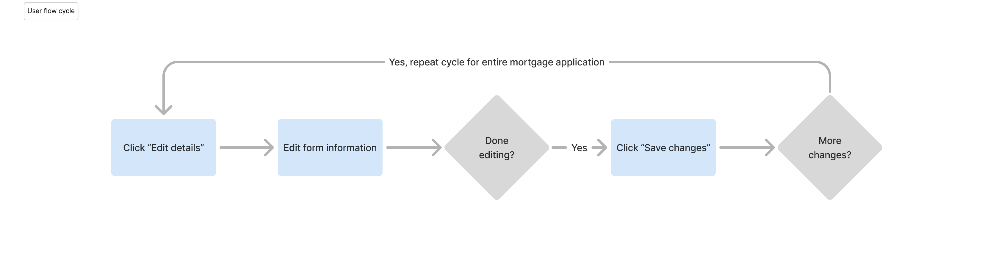
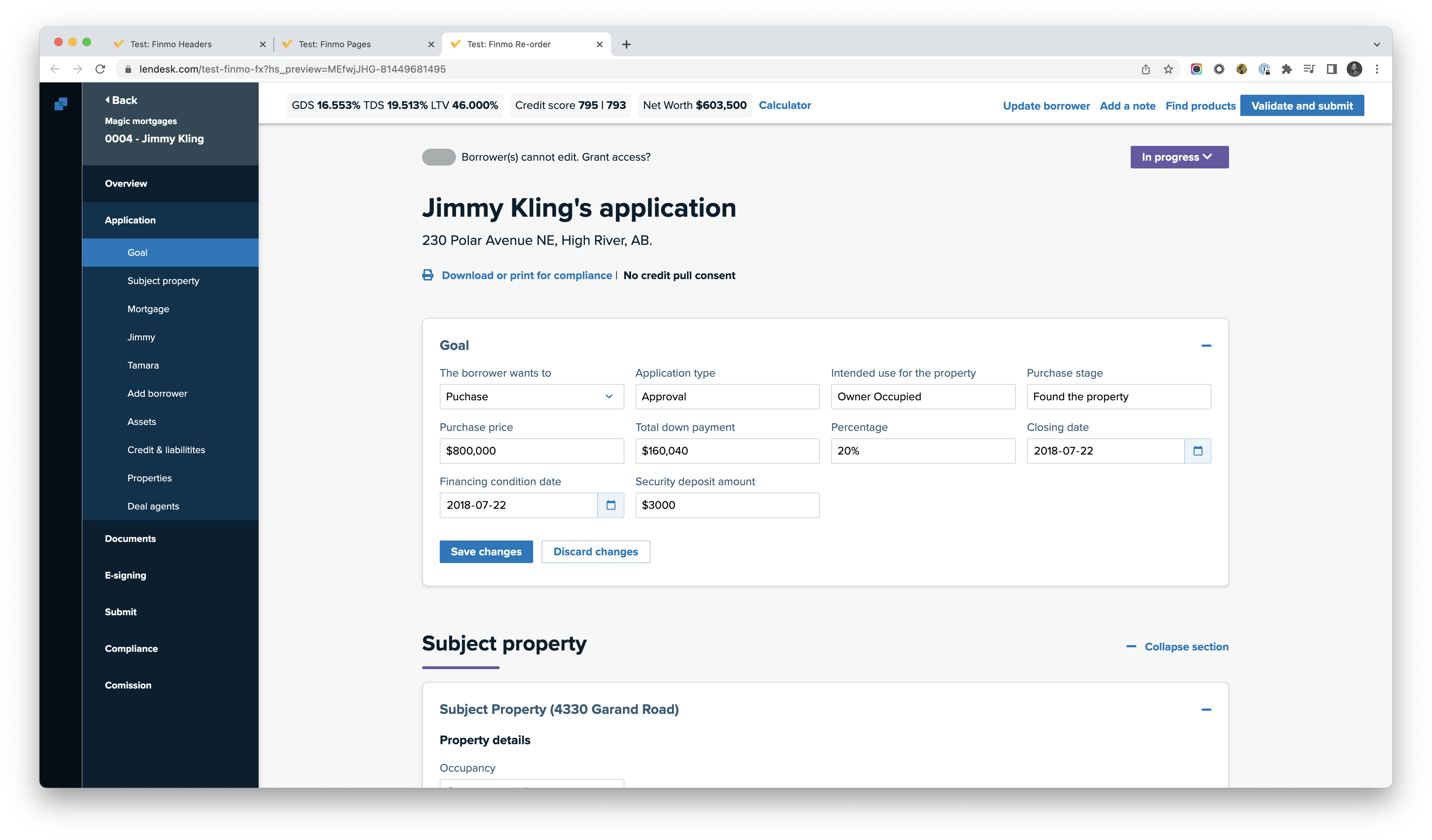
Mortgage brokers work under extreme time pressure, yet we discovered that modifying application details in Finmo required repeated mode switching between viewing, editing, and saving across dense forms.
Collectively, these steps created cumulative friction:
Too many clicks and excessive scrolling
Loss of confidence that changes were saved
Risk of error and rework in high-stakes financial tasks
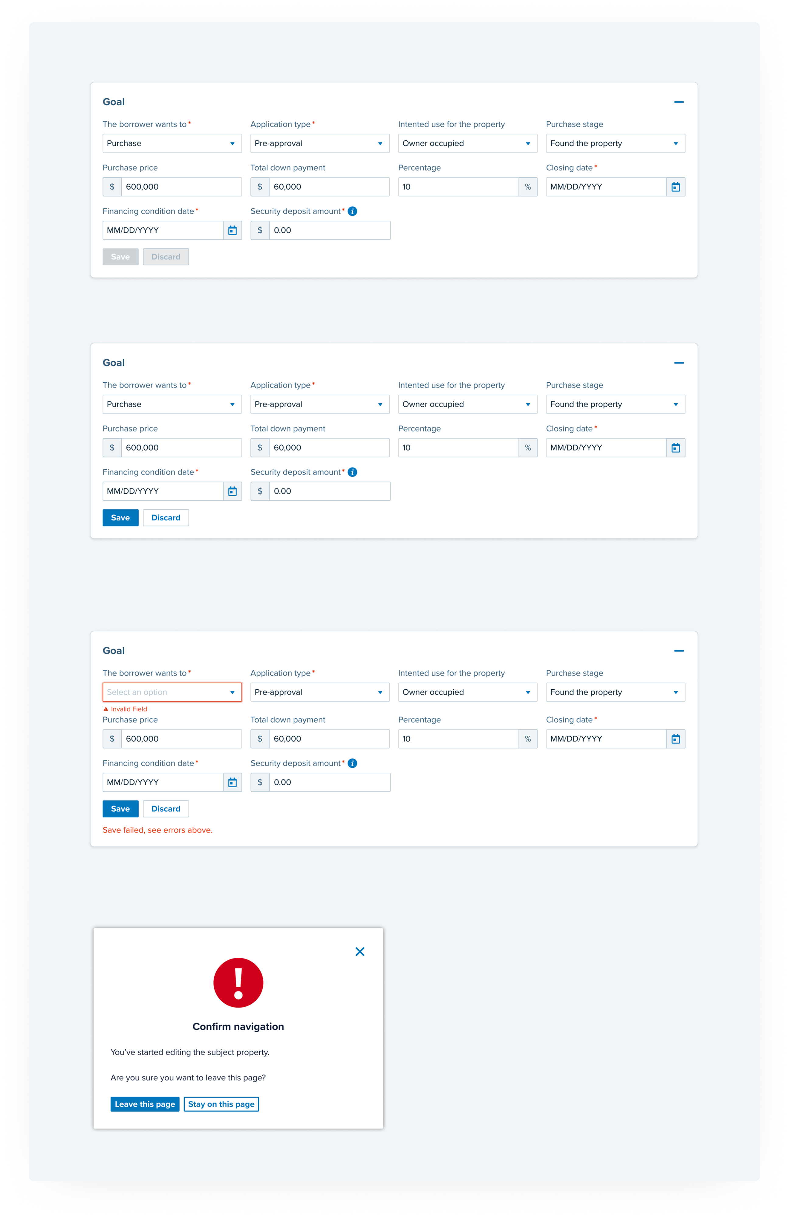
We realized the real problem was that the interaction model did not match how expert users think when they are under pressure. Mode switching introduced unnecessary decision points: "Am I editing or viewing?", "Did this save?", and "Where am I in the form?" We framed the problem as a structural interaction issue rather than a UI annoyance.
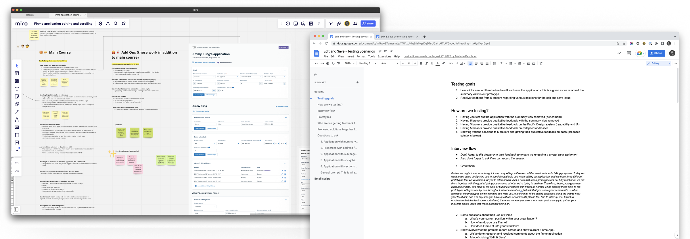
We explored three structural approaches to solve this:
We prioritized cognitive flow over familiarity. We implemented fixed section headings that remain at the top of the screen and simplified address fields into text with an "edit" link to reduce visual noise and scrolling.
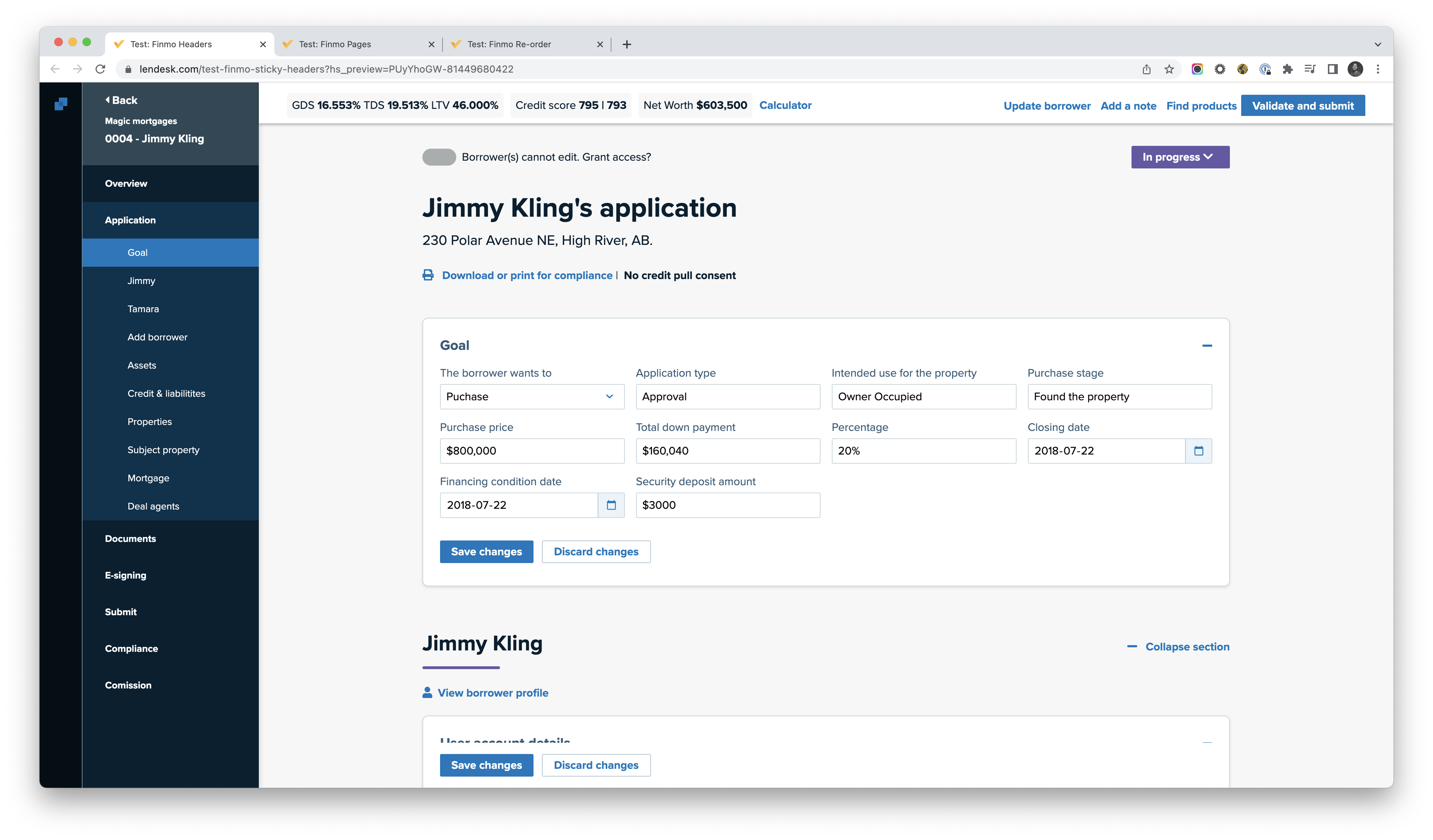
Because static prototypes couldn't capture these complex interactions, we built functional prototypes and tested them with brokers.
In high-stakes workflows, my goal is to make the system handle the "technical" state so the user can manage the "professional" task.
Reaching that point requires a significant investment in research and analysis. By spending the time to deeply test and iterate, we found a path that looked like a minor design tweak but functioned as a massive productivity boost. The outcome wasn't just a better form, it was the removal of a cognitive tax. We moved the UI out of the way so brokers could focus entirely on their clients.
Structural clarity matters more than polish. When we align a system with a user's mental model through rigorous testing, we turn the interface into an invisible tool that just works.

