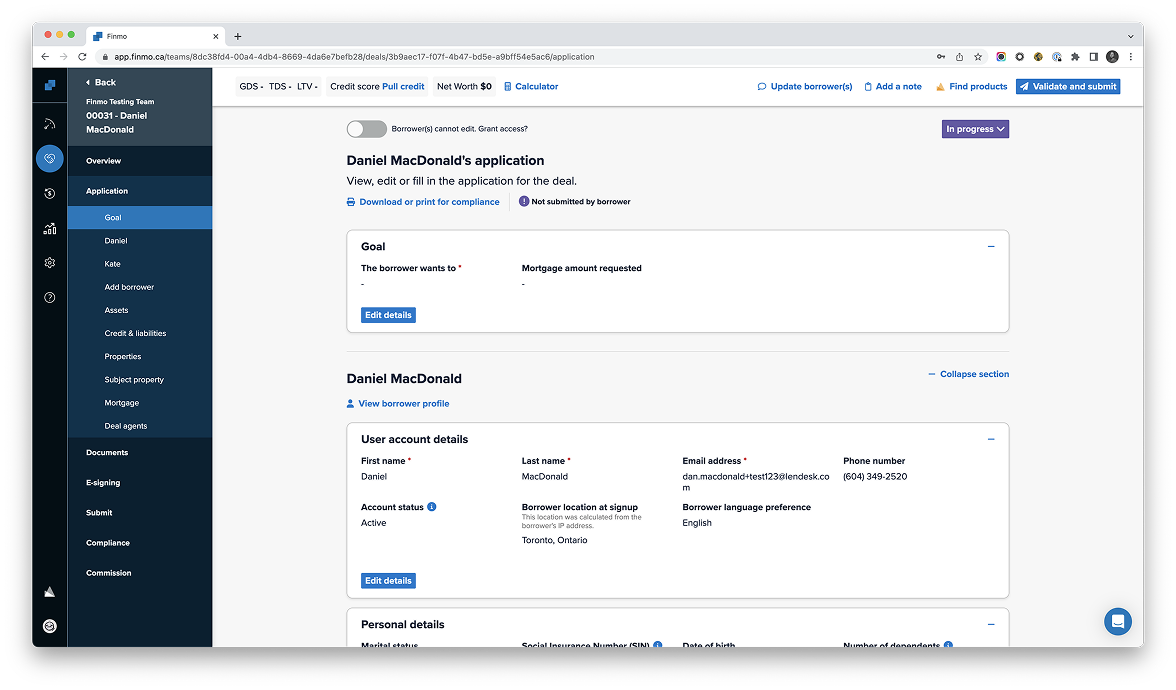
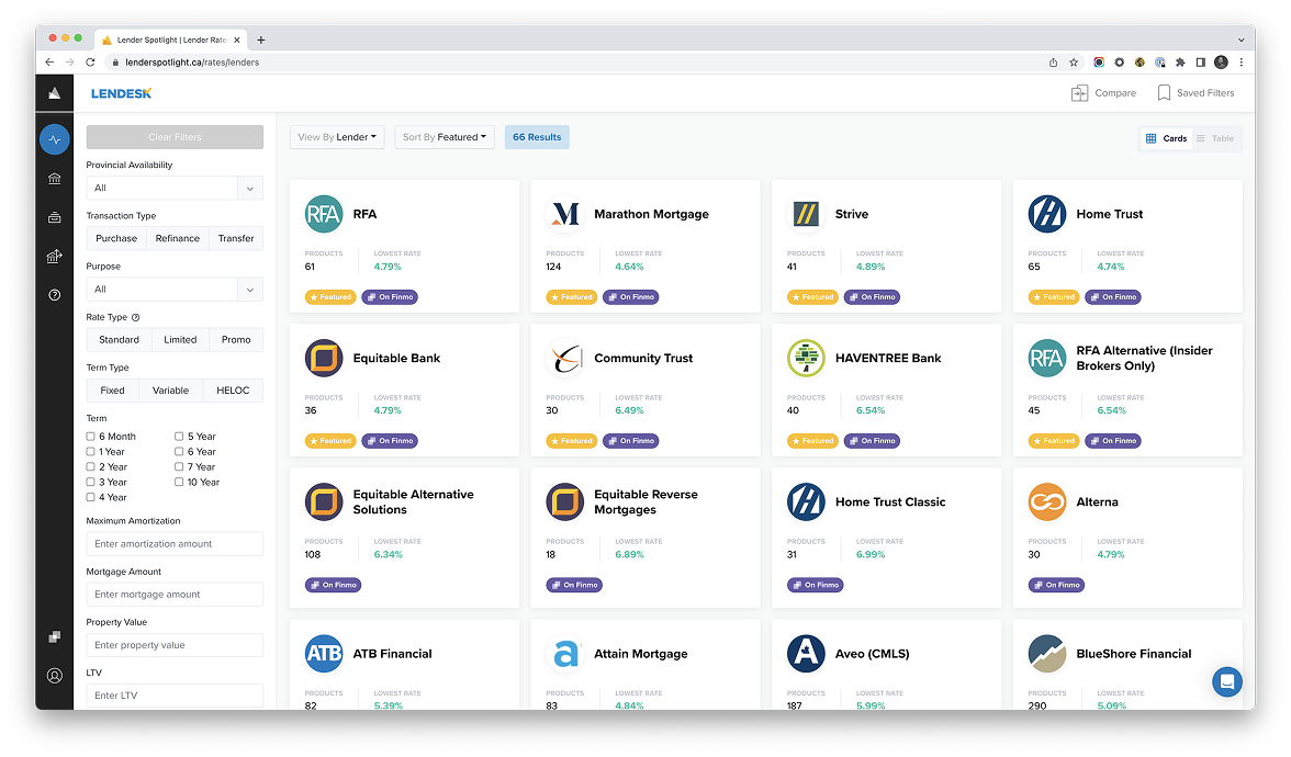
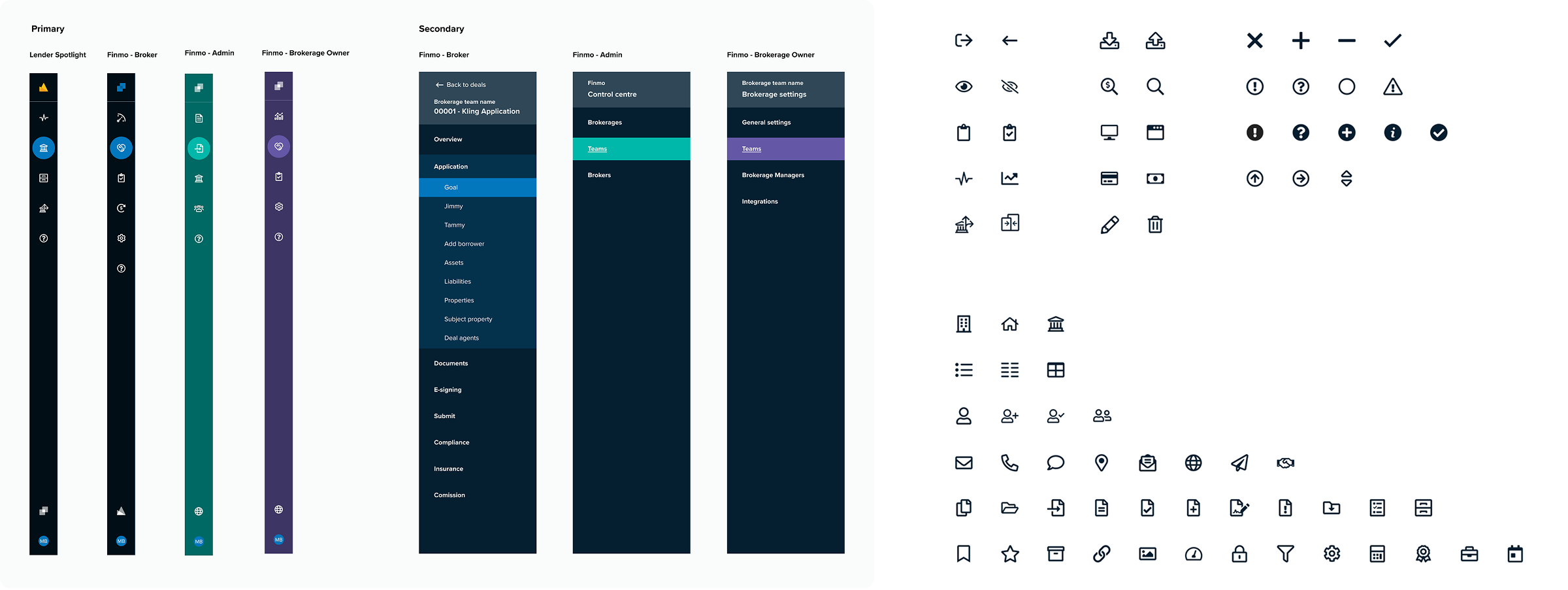
Finmo and Lender Spotlight served overlapping users but behaved like separate products. Core interaction patterns, visual hierarchy, and component behavior diverged significantly. This caused users to stop relying on intuition and start double-checking every action. We recognized that the deeper risk was the erosion of user trust in how the system behaved.
There was no single owner for cross-product consistency, so we stepped into that gap to frame design inconsistency as a trust and efficiency problem. Our goal wasn't just to "ship a design system," but to reduce complexity without destabilizing existing workflows.
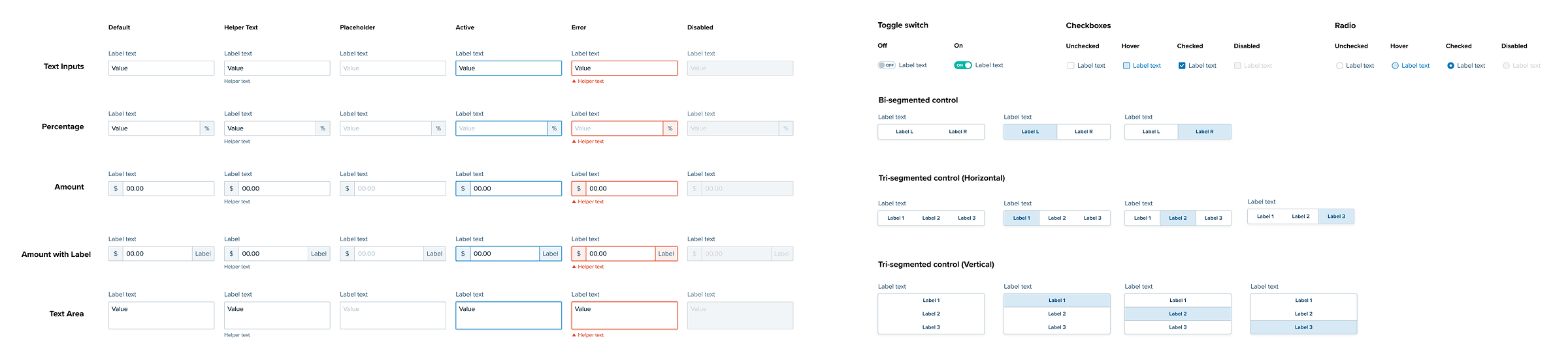
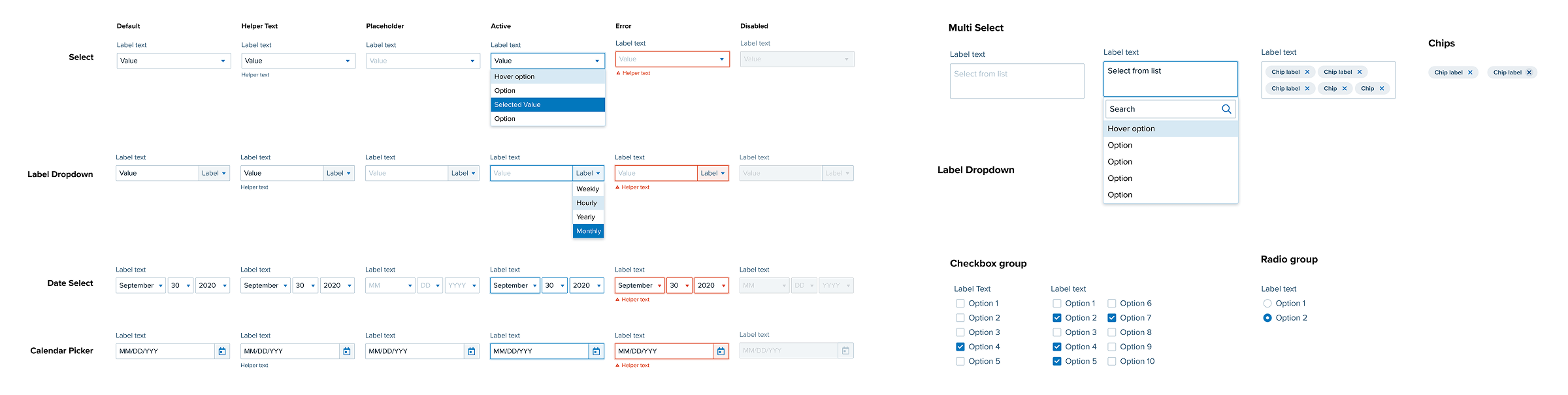
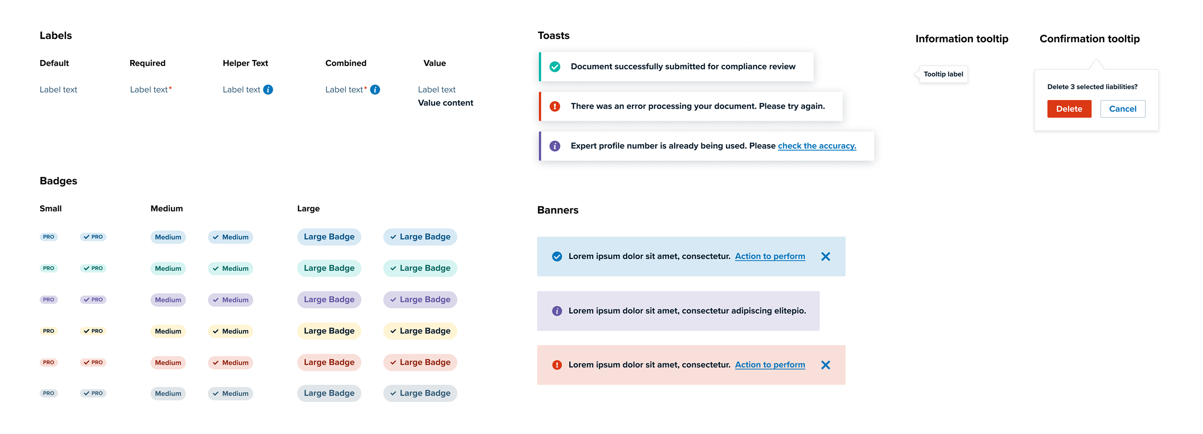
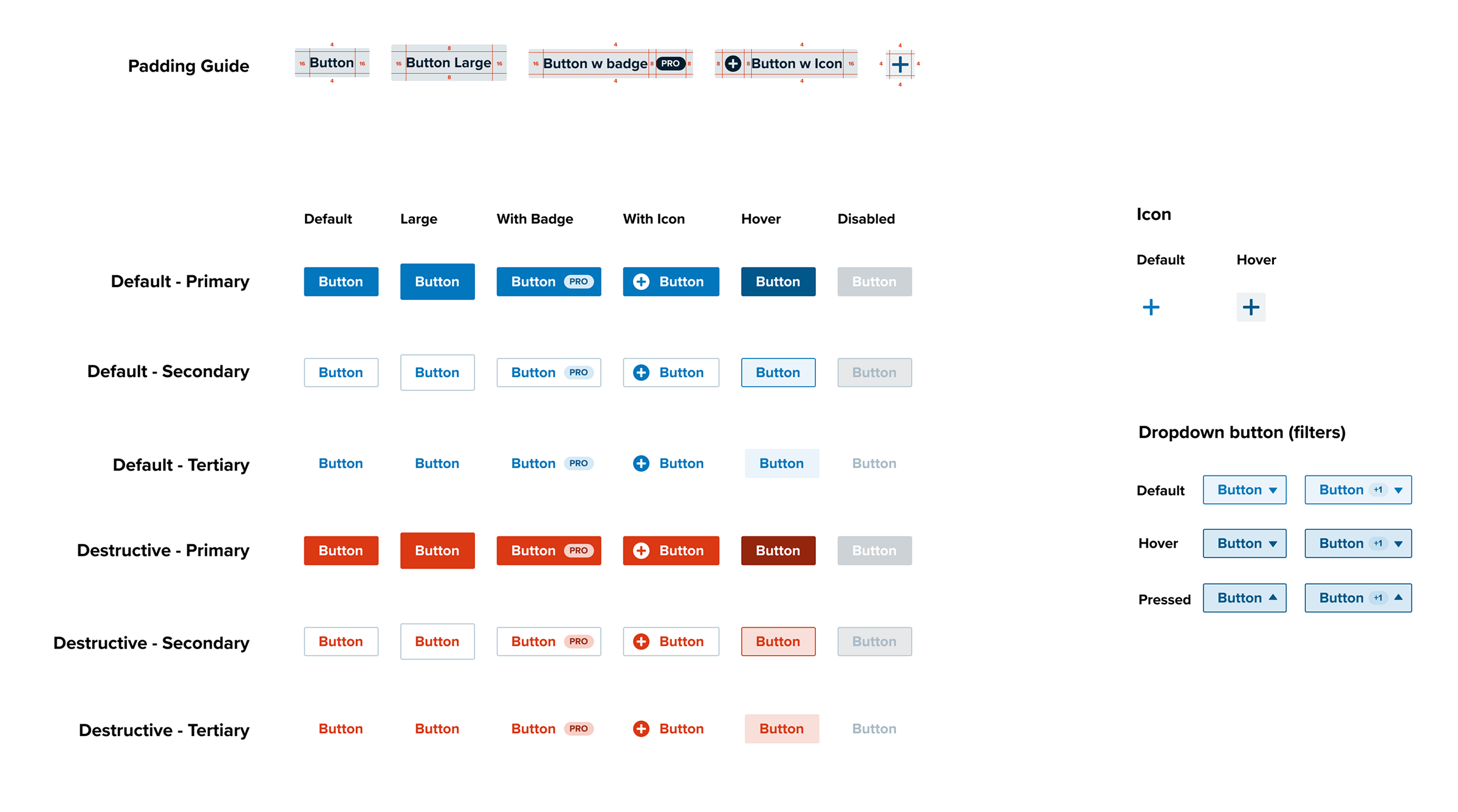
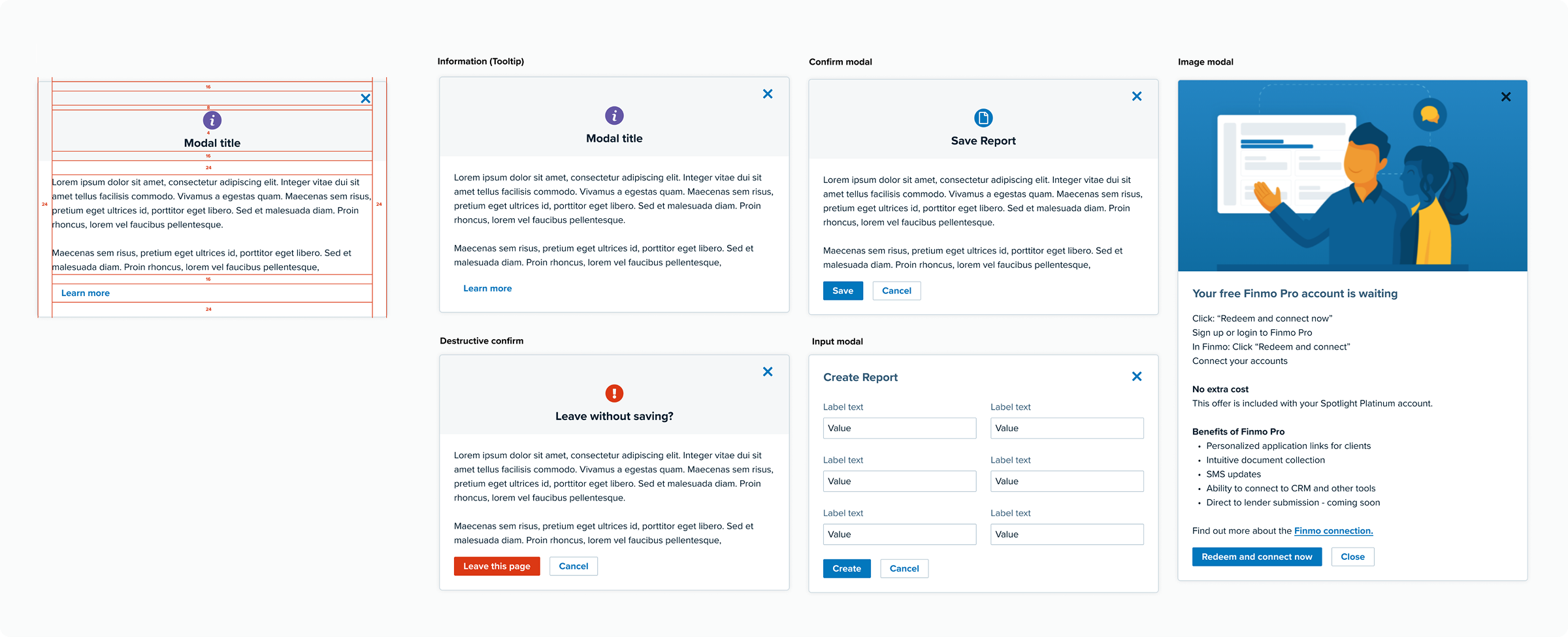
We audited every interactive element—including buttons, inputs, modals, tables, and icons across default, hover, disabled, and error states.
We evaluated patterns based on:
Can users anticipate how the system will behave?
Does the design add unnecessary decision-making?
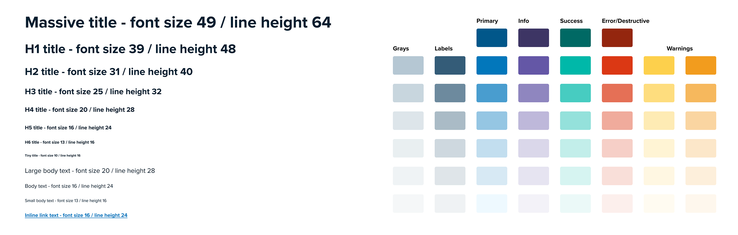
Improving contrast, hierarchy, and legibility
Ensuring the components could grow with the platform's complexity


We made several intentional decisions to clarify the system's intent:
Prioritized typography and hierarchy first and accepted short-term inconsistency to avoid disruptive, large-scale changes.
Reduced buttons to three semantic types to clarify intent.
Simplified modals into display vs action-oriented categories to reduce user hesitation.
This work established a shared UX vocabulary across the organization.
Significantly reduced design and engineering decision overhead for new features.
Provided the foundation for all future platform-level consistency work.
While the full system was not rolled out due to a business alignment gap, the project taught us that consistency must earn its way into the product through business-critical workflows.
In most products, there is a natural tension between design’s need for consistency and the business’s need for speed. I’ve learned that timing these alignments is critical to creating momentum.
Consistency shouldn't be forced; it must earn its way into the roadmap by proving it can solve a high-priority problem. If a system change doesn't align with what moves the needle for the business, it will likely stall. Today, I look for the "strategic windows"—moments where a platform update can directly support a critical feature launch.
Systems only scale when they are treated as essential infrastructure. By focusing on the intersection of user patterns and business priorities, I ensure our design work is a multiplier for the entire team, not a separate line item.
